Pinster is an inhouse project of Whitecode Labs. It is a mobile application to help travelers build a catalog of the places they visit or want to visit, bookmark them and share their tips, recommendations and itineraries with others easily.
I worked as a UX designer intern handling the information architecture and visual design of the application. I collaborated with one project mangaer and two developers for this project.
There were too many competitors in the market with travel based application. We needed to find our niche and provide right solutions to the travelers.
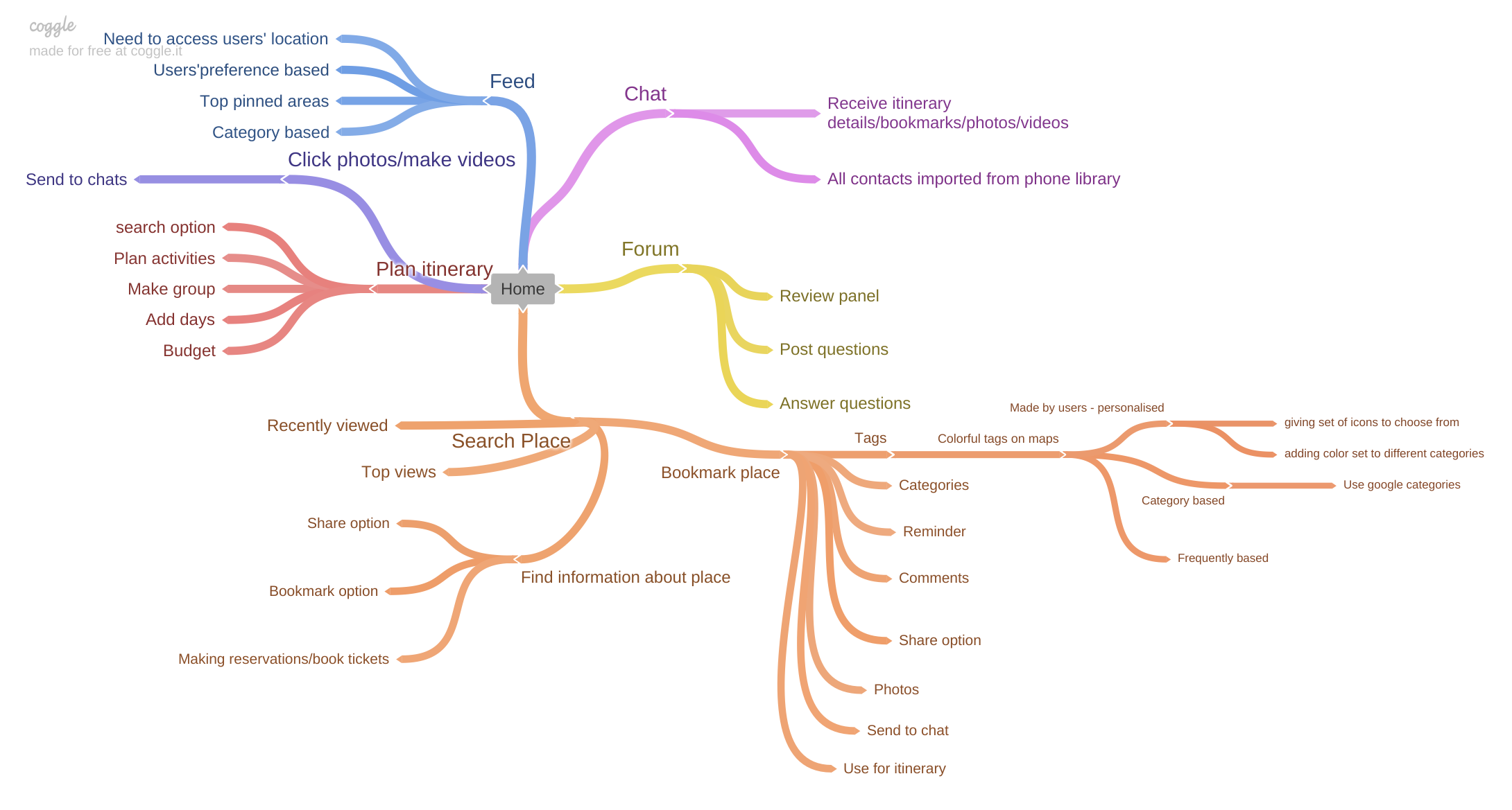
I did stakeholder interviews and brainstormed ideas using mind map to decide what are the requirements of a traveler and what solutions can we provide them.
We decided to build basic function of the app - bookmark places, and then add on other features. Thus after the discussion, it was decided to build following features in the app:
- to search for places
- to bookmark their favourite place and organize those bookmarks
- to find useful information for the searched places
- to check reviews and ratings for that place
- to share information and photos of a place with others
Having a clear understanding of the project scope and goals, I conducted a competitor audit wherein I studied the competitive products in the same domain. I looked at Foursquare, Holidify, Facebook Local, Yelp and Mapstr to get better understanding of how apps in this domain are structured.
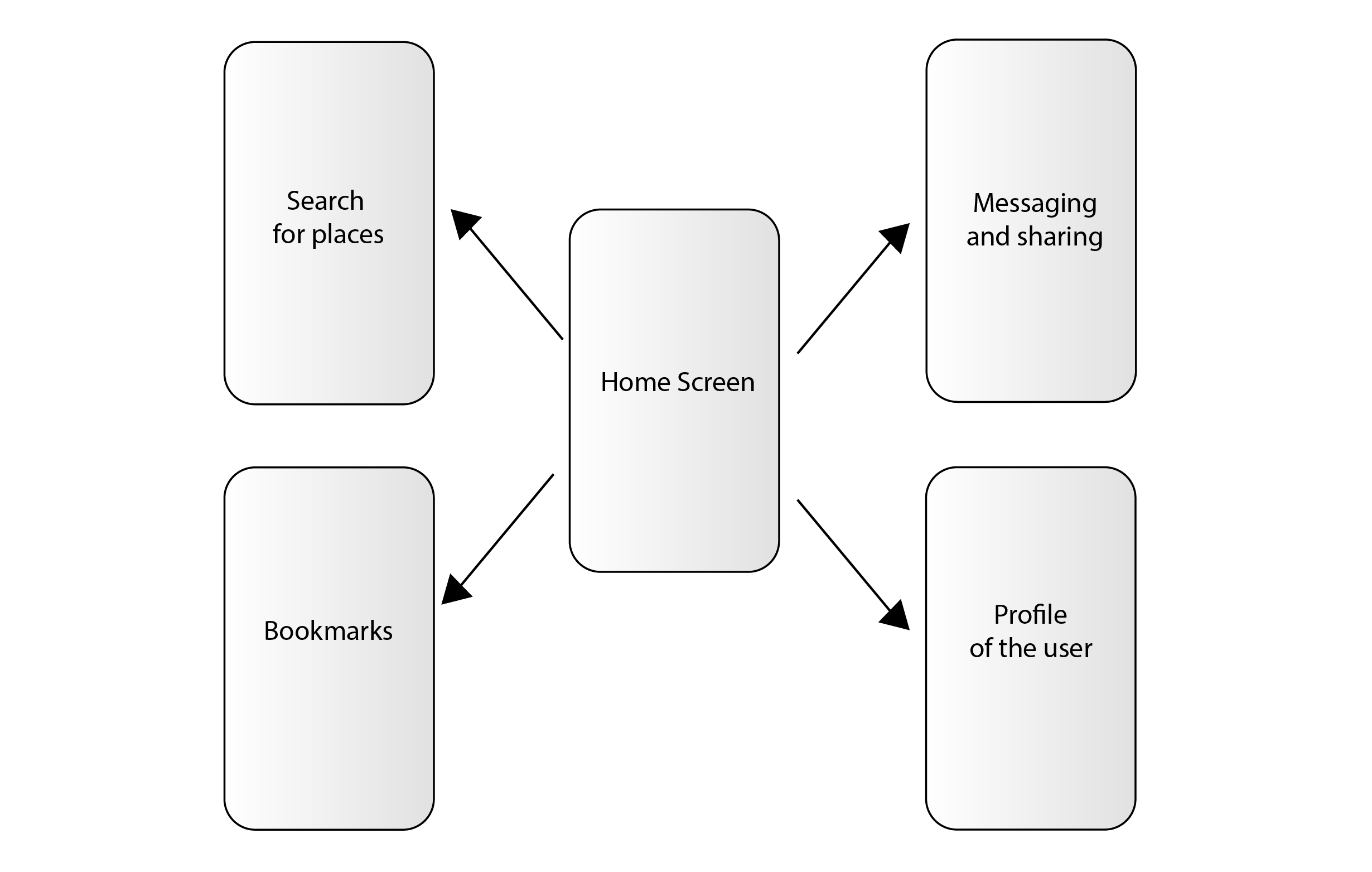
We used Hub and Spoke IA for multifunctional tools - each with its own integrated navigation and purpose.
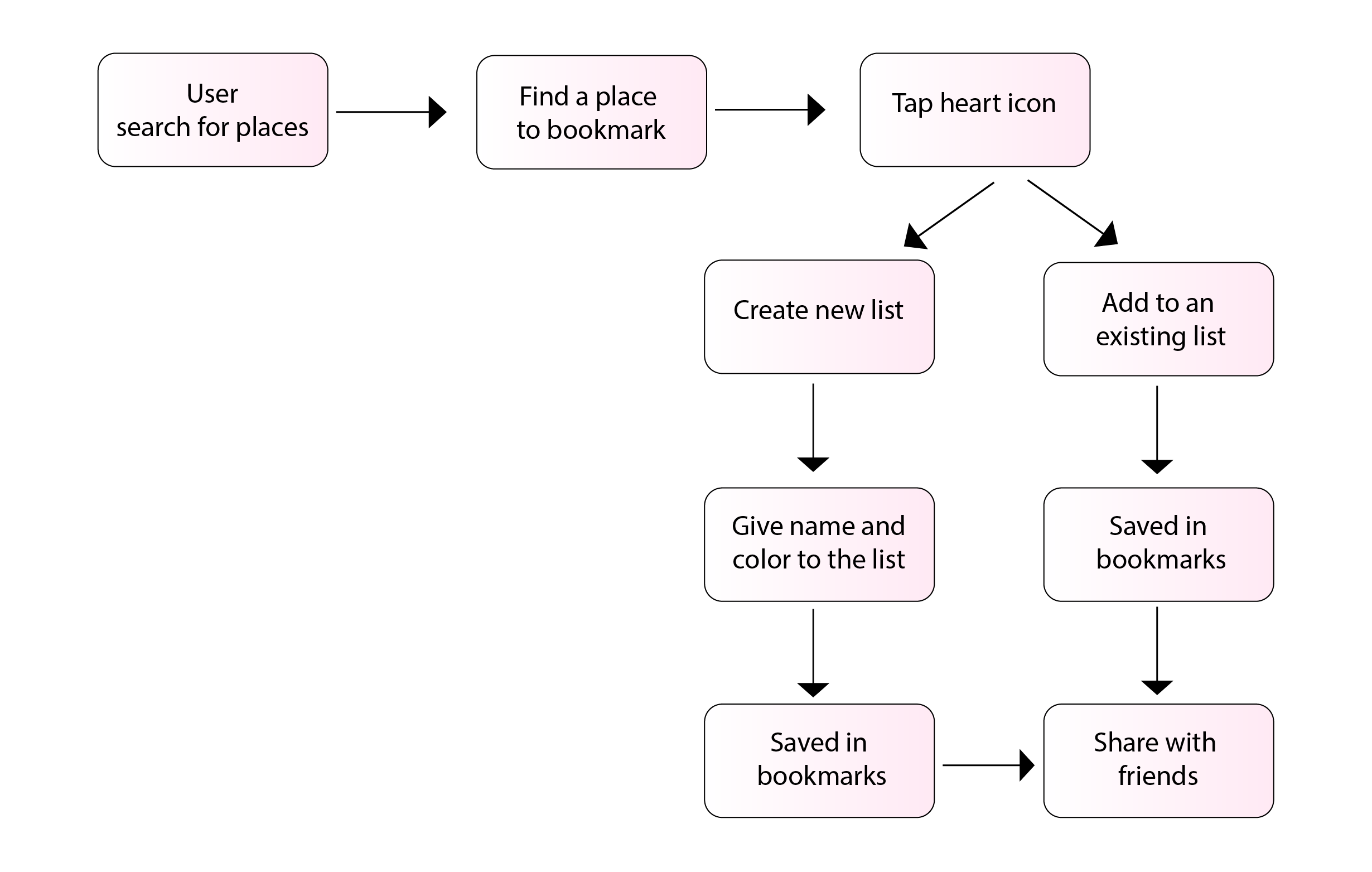
Follwing is the user flow created to analyse the user journey for creating bookmarks in the app
After solidifying our IA, I jumped right away to step 1 of wireframing, which is hand sketching layouts. It was helpful to throw out all ideas on pages and then experimenting on different design approaches. Then, these initial sketches were translated to digital wireframes and I sought feedback from the management and the developers. Then the changes were incorporated as per the feedback and once the design functionality was final, I designed the high-fidelity wireframes and prototyped them using Adobe XD.
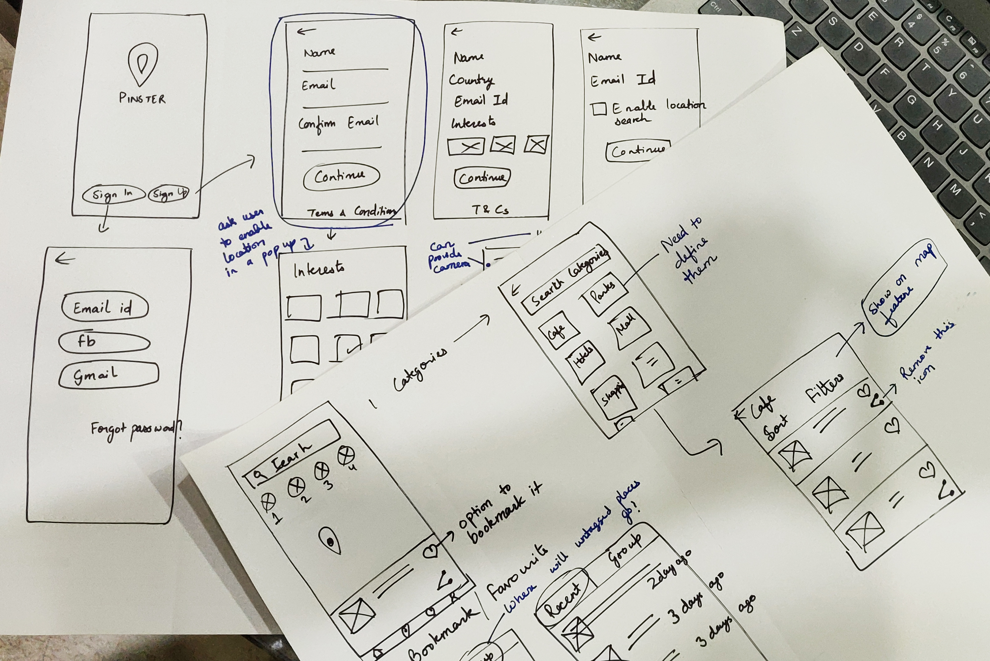
Initial Sketches
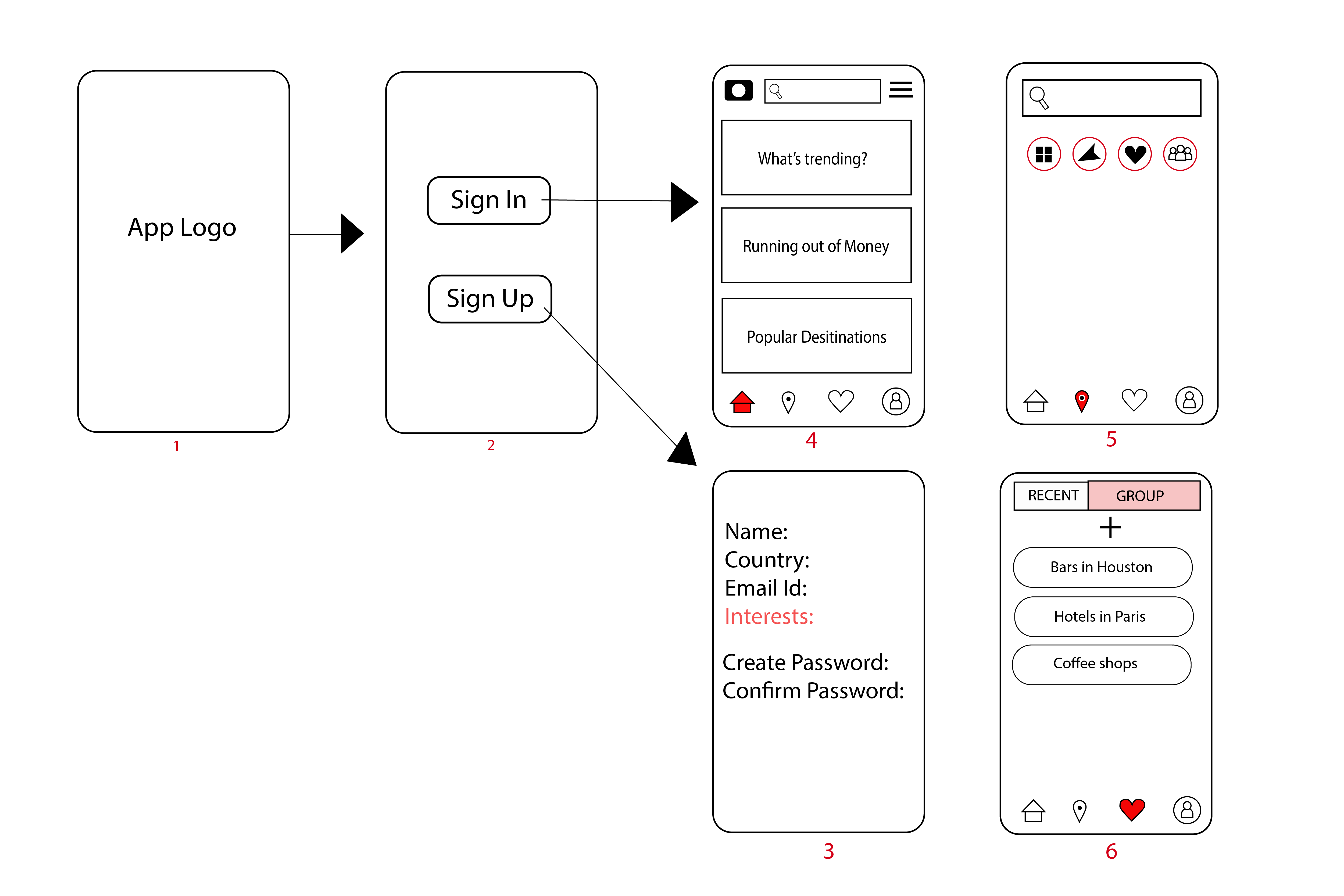
Low Fidelity Wireframes
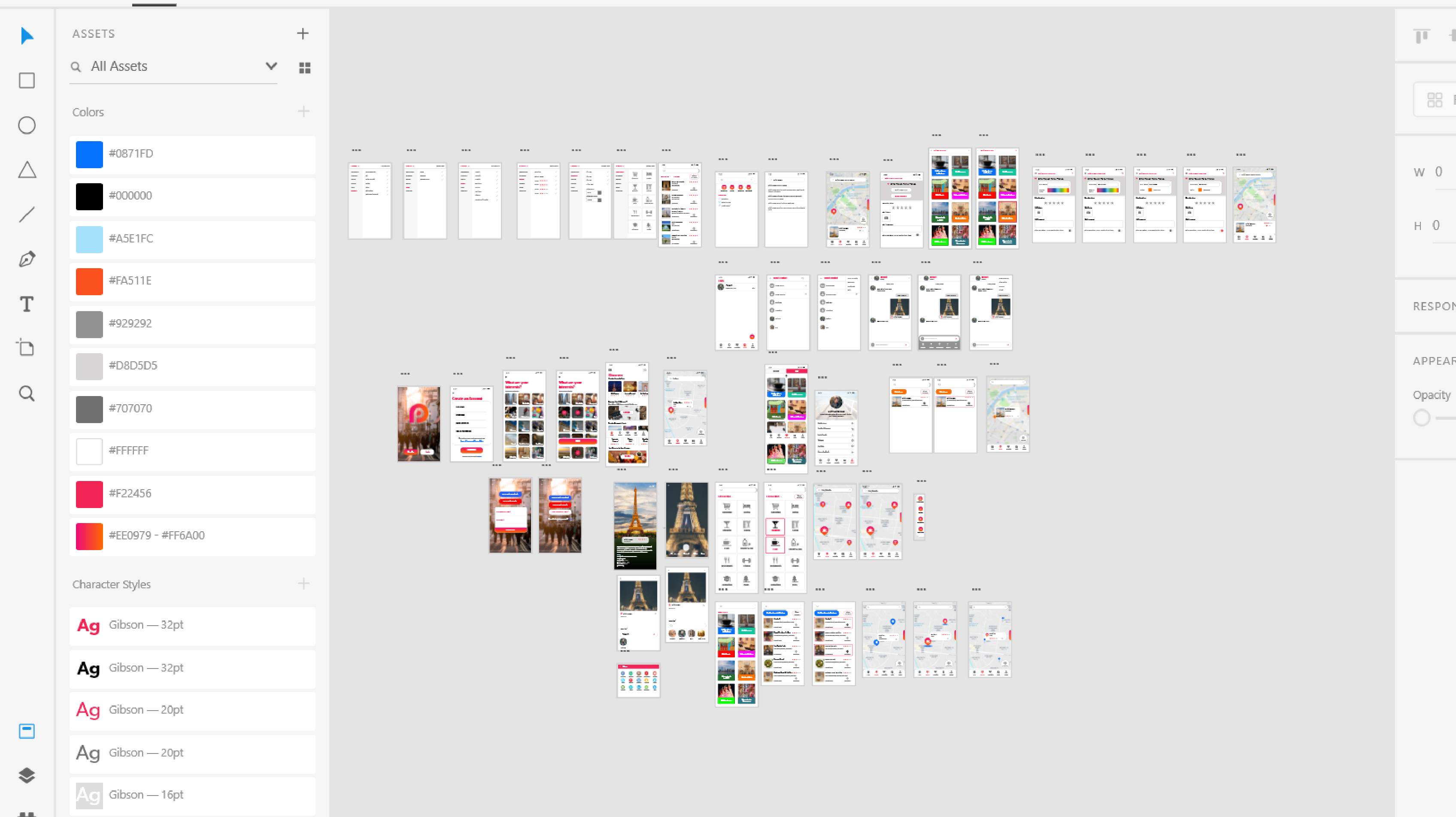
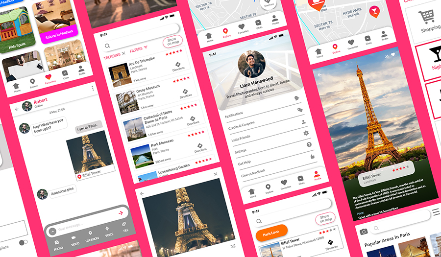
High Fidelity Wireframes in Adobe XD
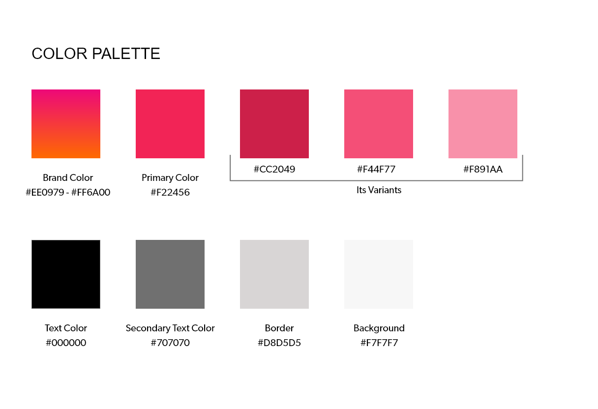
For choosing the color palette, we had to keep in mind the brand colors of our competitors. We tried avoiding the use of blue, purple and red as our brand color. After having discussions with the management, we listed the brand attributes of the product - Pinster as follows:
1. young and energetic
2. gender neutral
3. friendly and approachable
Keeping these attributes in mind, we came up with following color palette.
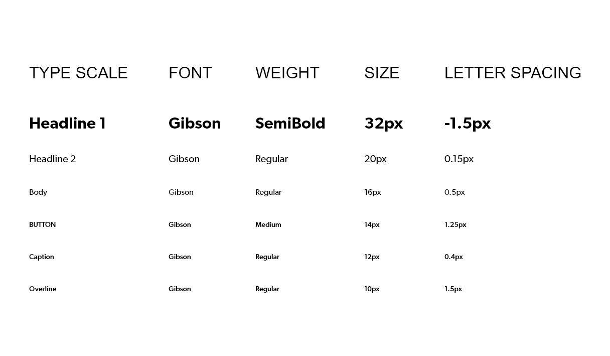
We tried different typefaces but we found the font family of Gibson to be the most suited for the product.Instead of using different fonts, I used different weights of the font - Gibson for different purposes like heading, sub-heading, body etc.
1. Since this was my first UX project, it helped me realize that we should define goals early. Having a good understanding of the business goals act as a guideline for the research phase and increase the effectiveness.
2. I also learned knowing less about user makes your design decisions less valuable and decided to work on that aspect in my future projects.
3. Studying other mobile applications from the same domain not only helps in information structure but also provides the best practices being followed in the industry, set the bar to enhance the UI design of the current app being worked on and also set some user expectations from the app beforehand.