About EXFX
EXFX company has partnered with top premium stores - salons and spas in two cities- Hyderabad and Chennai in India. The app users can book the services of these stores through the app and avail discounts on them, if any.
My role
I worked as a UX designer to redesign their mobile application- EXFX which was at alpha stage. I was the solo designer working closely with 4 developers and two project managers.
Duration - 5 months (May 2019 - Sep 2019)
Product goals
- To improve the booking service in the app
- To implement the model - from Pay Now to Pay Later
- To add personal concierge in the app to resolve the issues faced by the users
- To add reviews and ratings model
To accomplish these goals, the mobile app needed to be redesigned.
Result - After 1 month of redesign, the app saw 25% increase in salon service booking in Nov, 2019
Let's see how we tackled the challenges one by one
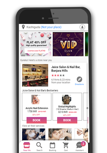
Challenge #1 - Users were unable to understand the features of the app
The users were finding it difficult to understand not only the features of the app but whether the services were being provided by EXFX itself or by a nearby salon.
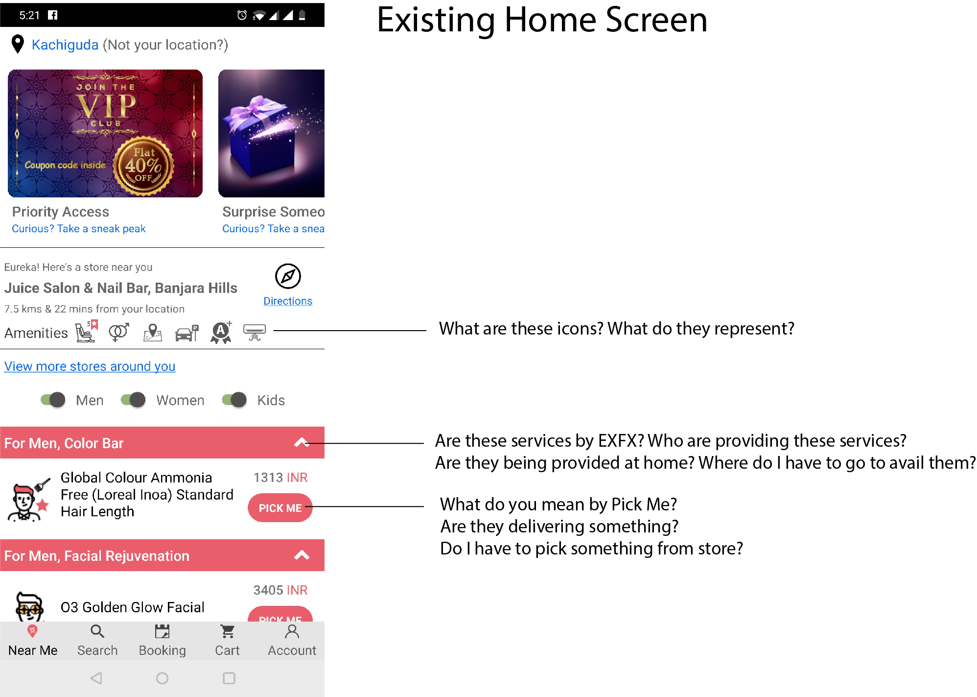
Solution: Building better Information Architecture (IA)
I started with redesigning the Information Architecture of the app based on nested model.
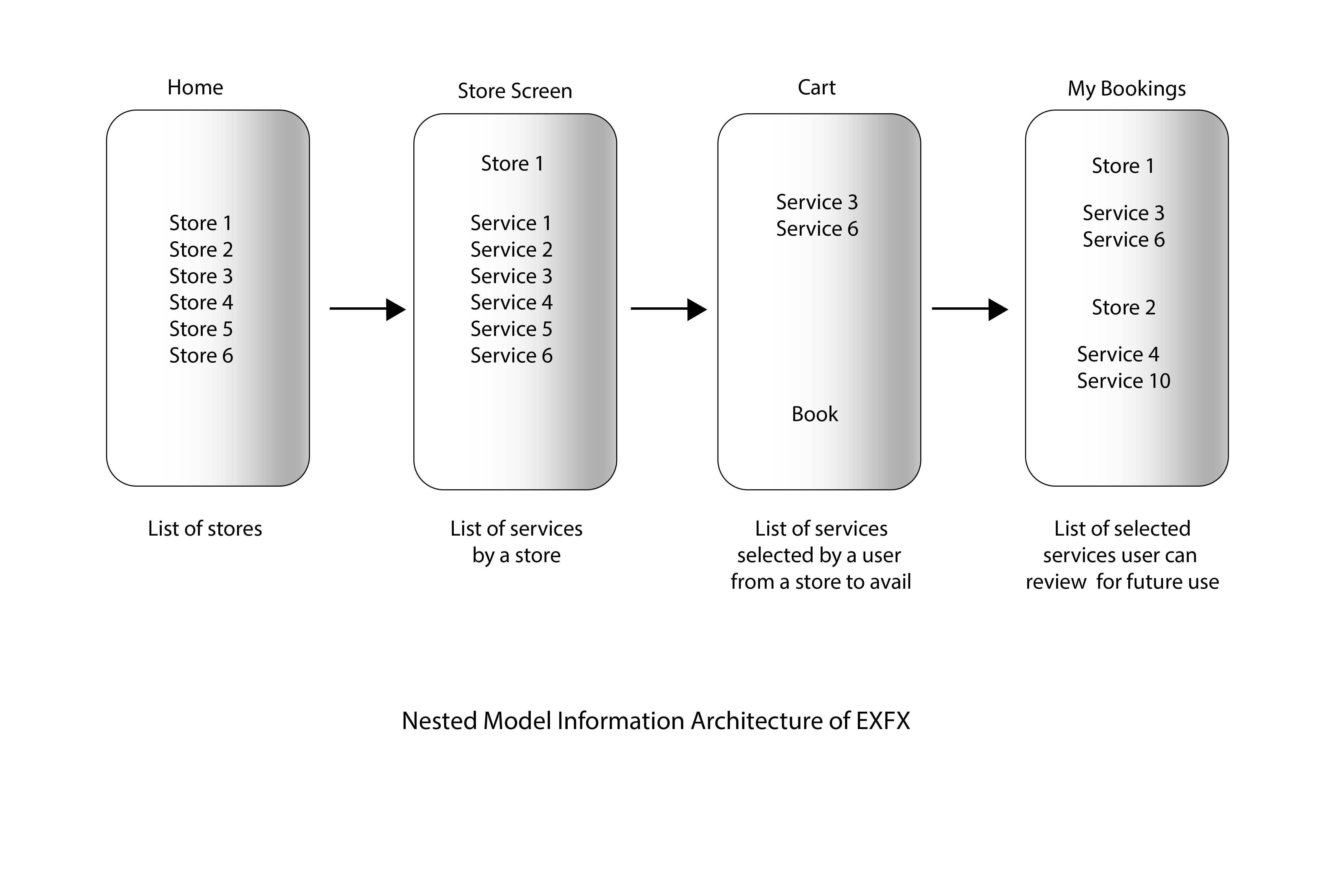
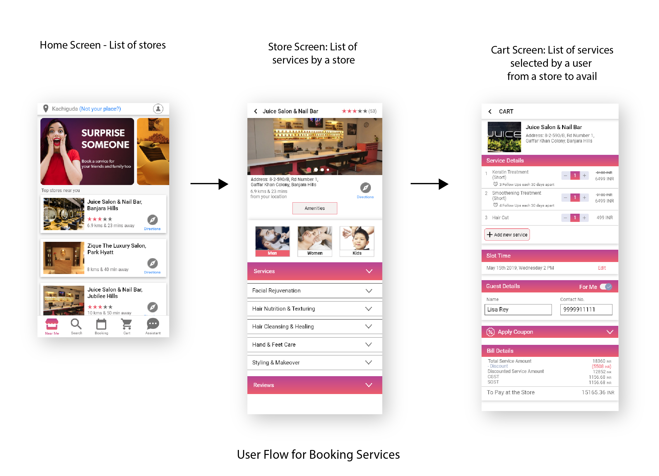
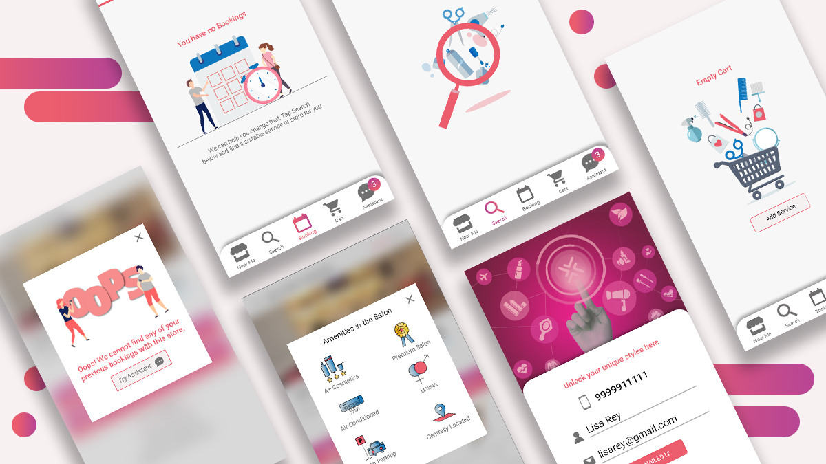
User Flow for Booking Services
IA of the app is now based on how the user can easily book the services through the app. Earlier there was too much information in one screen which was creating cognitive load for the users. So I break down the process into three screens to bring clarity to the user and help them focus on one thing at a time. (users don’t mind a lot of clicks as long as each click is painless and they have continued confidence that they’re on the right track—following what’s often called the “scent of information.” - Steve Krug, Don't Make Me Think).
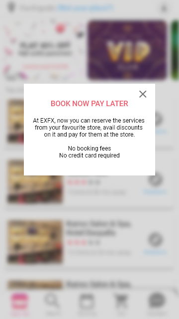
Challenge #2 - Business model changed from "Pay Now" to "Pay Later"
Earlier when the users booked their slot for the service in the app, they had to pay online on the app before availing the service in the salon. But considering the users' and business partners' preferences the management adopted the model wherein the user can book services from the app and after availing services from the store, the users can pay at the store upfront. They don't have to pay online. The payment is directly going to the store.
Solution: Defining CTA and notifying users of this change
To notify this change, we decided to use pop-up at the homepage.
We redefined our Call to Action (CTA) buttons from PICK ME to RESERVE. This change helped users in realizing that the app is only reserving the slot, not asking for payment.
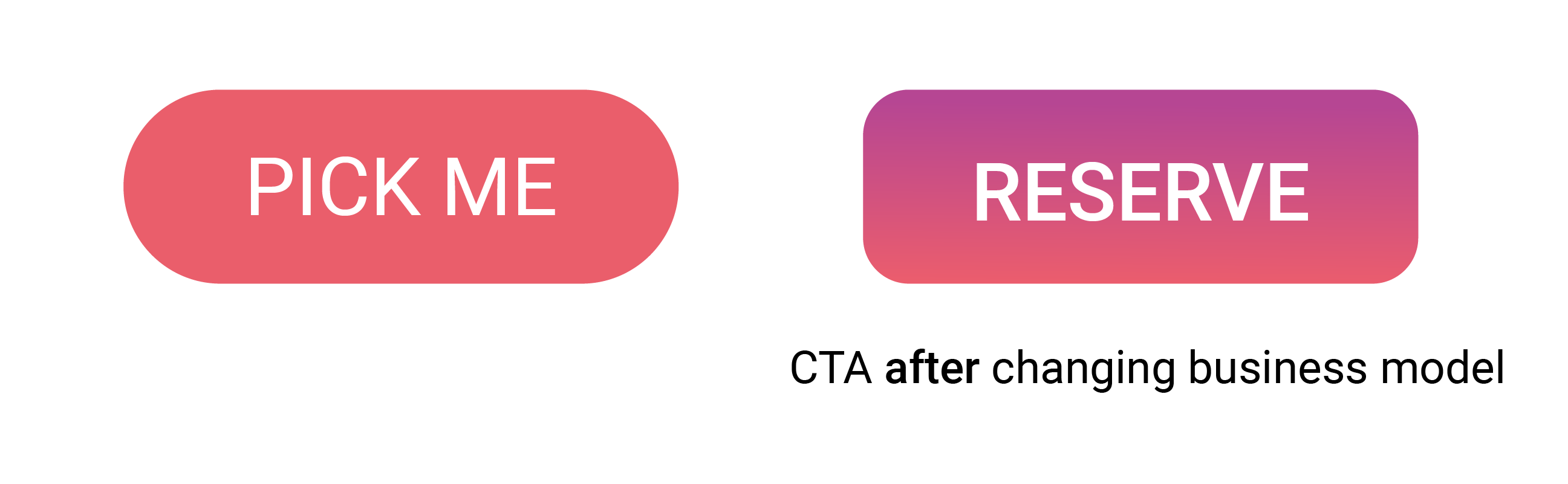
We also changed our copywrite of the app to make the message more clear.
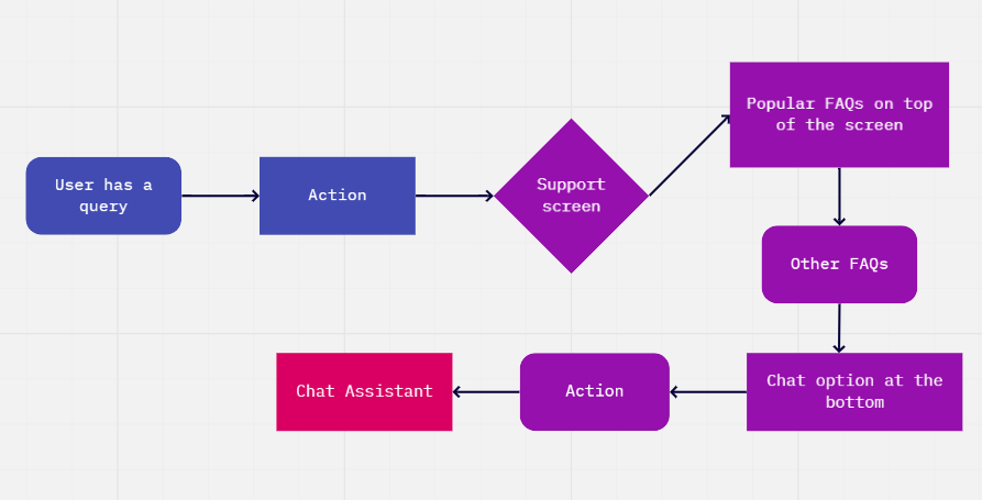
Challenge #3 - Provide personal concierge to the users
Earlier, there was no support or FAQ section for the users. The company had provided a Whatsapp icon in booked services section for the users for customer support but it had low discoverability.
Solution: Personal Concierge in bottom navigation
Since there was no 24*7 support system in the current phase, so I designed FAQ section along with chat option, so that the users can first check if their query is first being answered in FAQs or not. For this I first designed the user flow and then designed screens accordingly so that the support gets less queries. Following is the user flow chart of how the user can navigate through app for their queries:

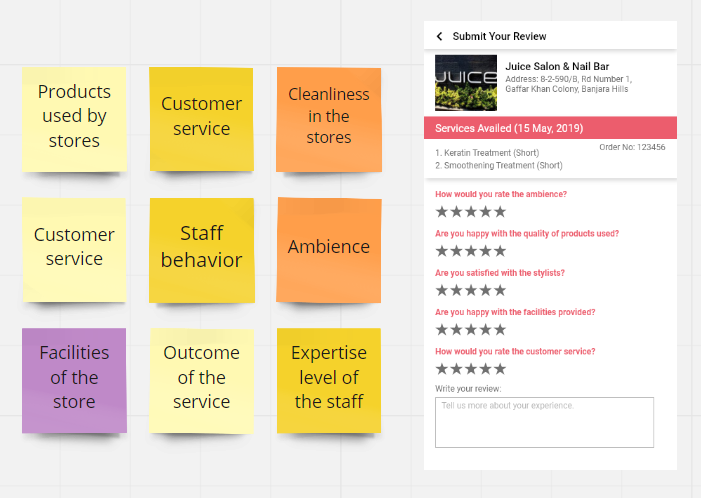
Challenge #3 - Develop Reviews and Ratings model
Since the users rely heavily on the ratings and reviews provided by their peers, it was decided to integrate this feature in our app.
Solution: Integrate reviews and ratings in each store page
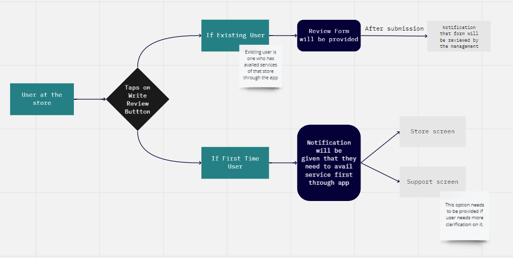
Above is the user flow of how user will navigate through ratings and review model. Below are the questions that need to be asked from the users while they rate a store.
But what about users who have not availed service from app and they try to provide review for that store?
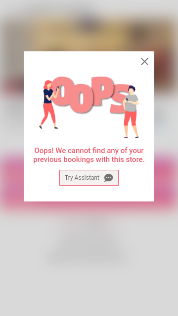
Through this message and illustration, we take away the blame from users and try to convey them that you need to have completed booking with the app to provide ratings for the store. For further assistance, we direct them to the support section of the app.
User Testing
Once the high fidelity wireframes were approved by the management and the developers, the developers built apk. All the members of the team tested the apk in their surroundings with 2-4 users to gain the feedback and the following are the points we realized:
- There was a better understanding of the app features than before.
- The placement of buttons and labels were improvised for smooth task flow for the users.
- It is important to show better quality of images for the store. The users will judge the ambiance and service quality of the store by the its images that are provided in the app.
- Though in current scenario, we may not have a very comprehensive list of services in the store screen, but when in future we have that, we will require a better filter approach for the users to filter out the unwanted services and provide them their intended results.
Visual Language
Since I played the role of visual designer as well, I made sure that all the issues of UI were being addressed at company's brand level.
- I set the visual language of the entire app with the guidelines of the company's branding.
- I created some custom icons, illustrations and edited images for the app.
Learnings from the project
- It is important to know what are the business constraints before designing a product. A product has to be designed is such a way that it can meet the needs of both the business and the users.
- By collaborating with developers on early stage, the design hand-off process becomes easier.
- It is important to test the product with users at every stage as it brings new insight and help improve upon features. Also since the cost and time of production involved is high, user testing helps in ensuring that the goals aimed to be achieved are being fulfilled.